Goldstar Native App
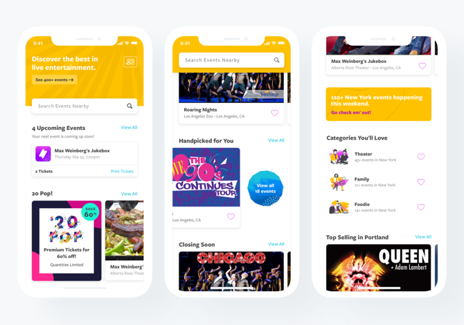
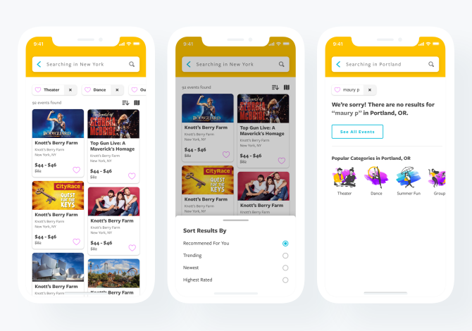
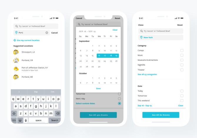
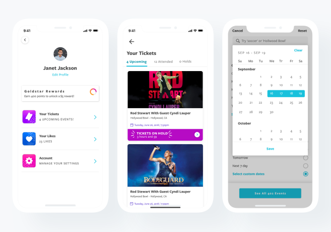
As product designer at Goldstar I was tasked to help with a major overhaul of our native application. The initial ask was to come up with a better start screen for the native Goldstar app to help drive personalized discovery of our event inventory. Goldstar is the creator of an award-winning Matchmaker algorithm that was not being fully utilized to increase conversion and enhance our product. With the knowledge we gained from our users we had the opportunity to greatly enhance the user experience.
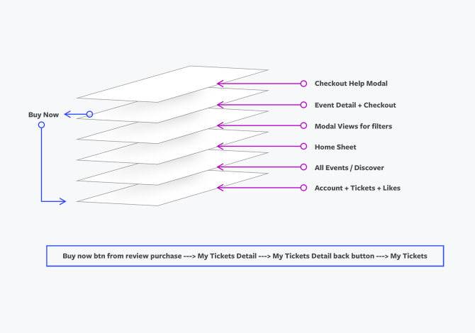
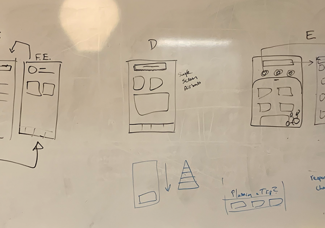
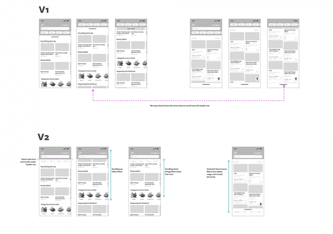
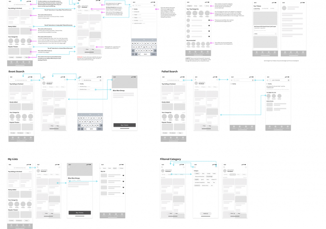
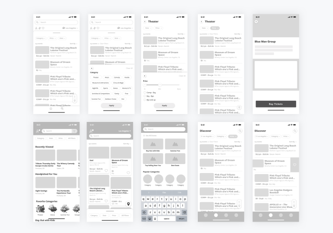
The initial parts of the project that I was heavily involved with include pairing with one of our UX designers and our Senior VP of Product to fully understand the target user persona, the different use case scenarios and the major improvements we needed to have to make a difference. We explored several directions through an open design sprint and once narrowed down went to work on lo-fi wireframes even exploring animation at this stage to help with way finding and orienting the user to the new UI.
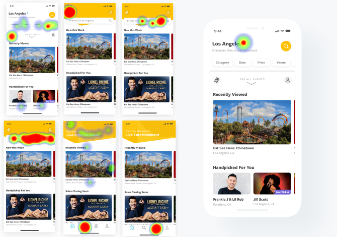
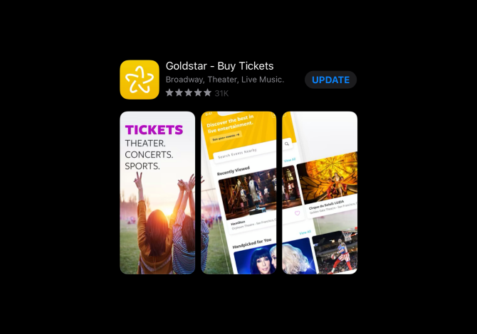
During the early stages and through the final end-product we were constantly testing to validate our changes and improvements to the UI. We did this through testing on Usability Hub and Maze. We also were lucky to have a Facebook community of really Goldstar members to test the new improvements and also get some qualitative data on the changes. The final release resulted in increasing conversion by over 28% and averaging a 4.8 stats in the App Store.
Project details:
- Client: Goldstar Inc.
- Category: Branding + Identity, Design, Product, UX/UI

