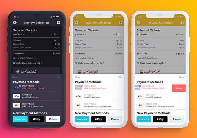
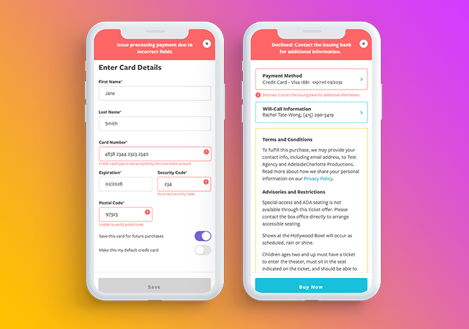
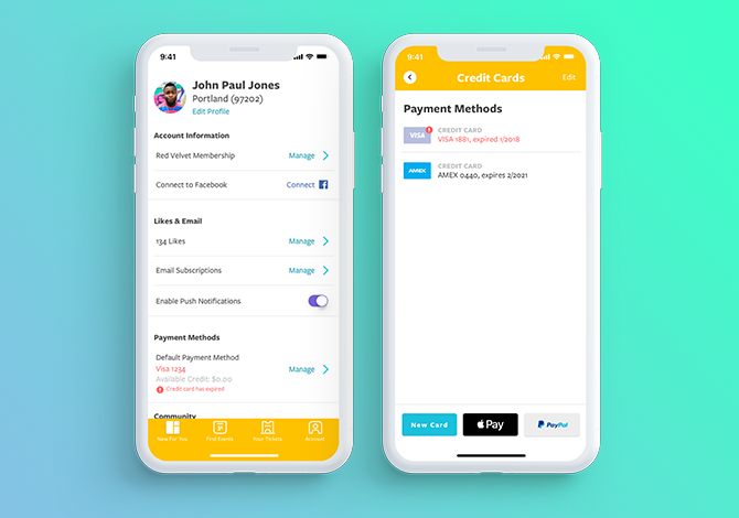
As a Product Designer for Goldstar Events, I paired with a UX designer to improve the UX and UI of our credit card errors in checkout. Prior to the project, we were not being clear about why a user could not complete checkout and the branding of our errors (if they did happen to appear) were not in alignment with our design system and ui patterns. We validated our improvements through usertesting.com, Customer Service interviews as well as a feedback from a pool of super user on social media. The improvements to the CC system decreased the time it took for people to successful purchase tickets through our app.
Project details:
- Client: Goldstar Inc
- Category: Design, Product, UX/UI, Web
- Live Preview: www.goldstar.com


